파이썬/데이터프레임
python(vscode)/그래프 여러개 그리기/데이터프레임 가볍게 만들기/subplot
gongdol
2023. 2. 13. 23:52
300x250
1. 예제파일을 만들자.
1) name 과 e1이 하나의 데이터 세트이다.
2) name이 중복되어 있다.
3) name 데이터는 1 3 5 7 9 와 1 2 3 4 5 로 나뉘어 있다

2. 코드작성
|
1
2
3
4
5
6
7
8
9
10
11
12
13
14
15
16
17
18
19
20
21
22
23
24
25
26
27
28
29
30
31
32
33
34
|
import numpy as np
import matplotlib.pyplot as plt
import pandas as pd
#1. 데이터 만들기
filename = r"C:\Users\Documents\test1.xlsx" #파일명 작성
data = pd.read_excel(filename) #data 변수에 엑셀 데이터를 넣는다
data1 = data.astype(np.float16) #용량을 줄여준다.
col1 = data.columns # 첫번째 칼럼을 col1 변수에 넣는다.
#2. e1,e2 데이터 그리기
fig = plt.figure(1) #첫번째 창만들기
plt.subplot(211) # 2행 1열의 첫번째 그래프
plt.plot(data1[col1[1-1]], data1[col1[1]])
plt.title("e1") # 제목
plt.legend(col1[1]) # legend
xmin = 0
xmax = 200
plt.xlim(xmin, xmax) # x축 범위
plt.subplot(212) # 2행 2열의 두번째 그래프
plt.plot(data1[col1[1-1]], data1[col1[3]])
plt.xlim(xmin, xmax) # x축 범위
# e3 데이터 그리기
fig = plt.figure(2) # 두번째 창 만들기
plt.subplot(321) # 3행 2열의 첫번재
plt.plot(data1[col1[1-1]], data1[col1[5]])
plt.subplot(323)
plt.plot(data1[col1[1-1]], data1[col1[5]])
#3. 그래프 그리기
plt.show()
|
cs |
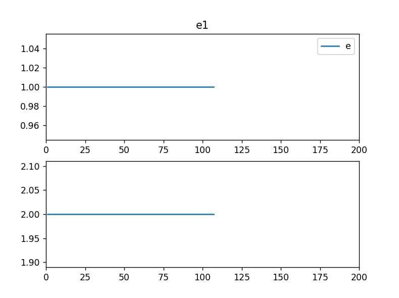
3. 결과
1) 그래프가 아래와 같이 두개 나온다.

300x250